8 Best SaaS Pricing Pages with Creative Design Elements
Huddle up, founders! Are you struggling with pricing pages that confuse or lose potential customers? Your pricing page SaaS is often the make-or-break moment where visitors decide to buy or bounce.
A clear, well-designed pricing page isn’t just nice to have—it’s essential, much like Jasper’s approach. It should instantly show different pricing options, features, and your value proposition in a way that makes choosing easy. When done right, it turns visitors into confident buyers ready to take action.
Let’s dive into some standout examples of pricing pages that get this perfectly right—and learn how you can do the same.
What Are The 8 Top SaaS Pricing Pages with Innovative Design Features?
Founders, great SaaS pricing pages do more than list plans—they combine clear pricing, strong social proof, and smart design to build trust and boost conversions.
We’ll highlight eight top SaaS pricing pages that excel with interactive options, simple layouts, and intuitive navigation. These saas pricing pages examples show how to engage prospects, simplify choices, and close deals faster.
#1 Salesforce - Incorporating Transparency and Flexibility
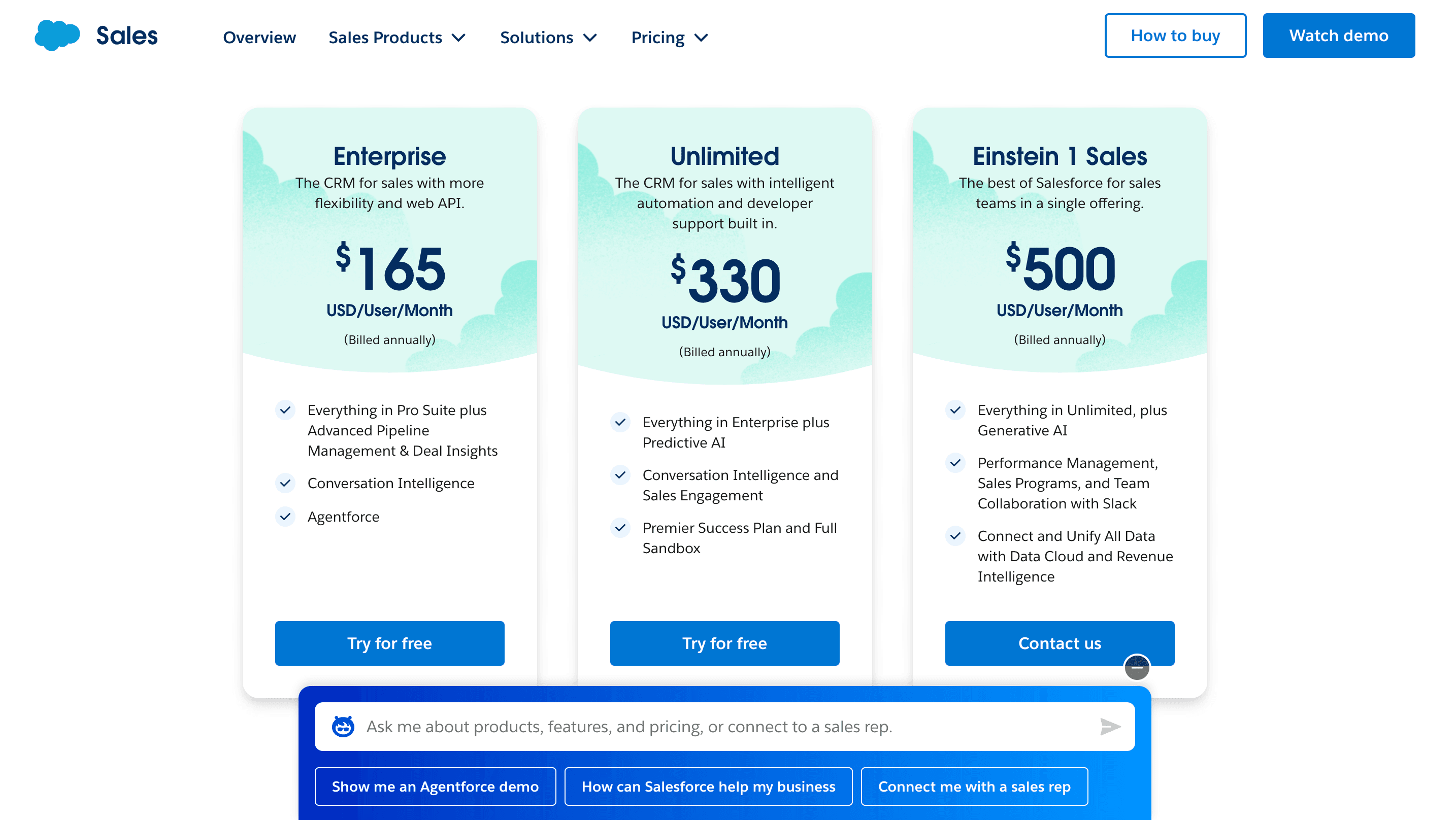
Salesforce's pricing page is designed to be transparent and adaptable, making it easy for users to understand their options and choose what fits best.
Tiered Plans: Clearly separated by business size and need, with all features listed.
Flexible Billing: Options include monthly, yearly, or custom terms to fit different budgets.
User-Focused Design: Clean layout highlights top features for each tier.
Upgrade Clarity: Benefits of higher tiers are easy to compare at a glance.
Transparent Strategy: No hidden details—everything is laid out for confident decision-making.
#2 Adobe Creative Cloud - Showcasing a Variety of Subscription Options
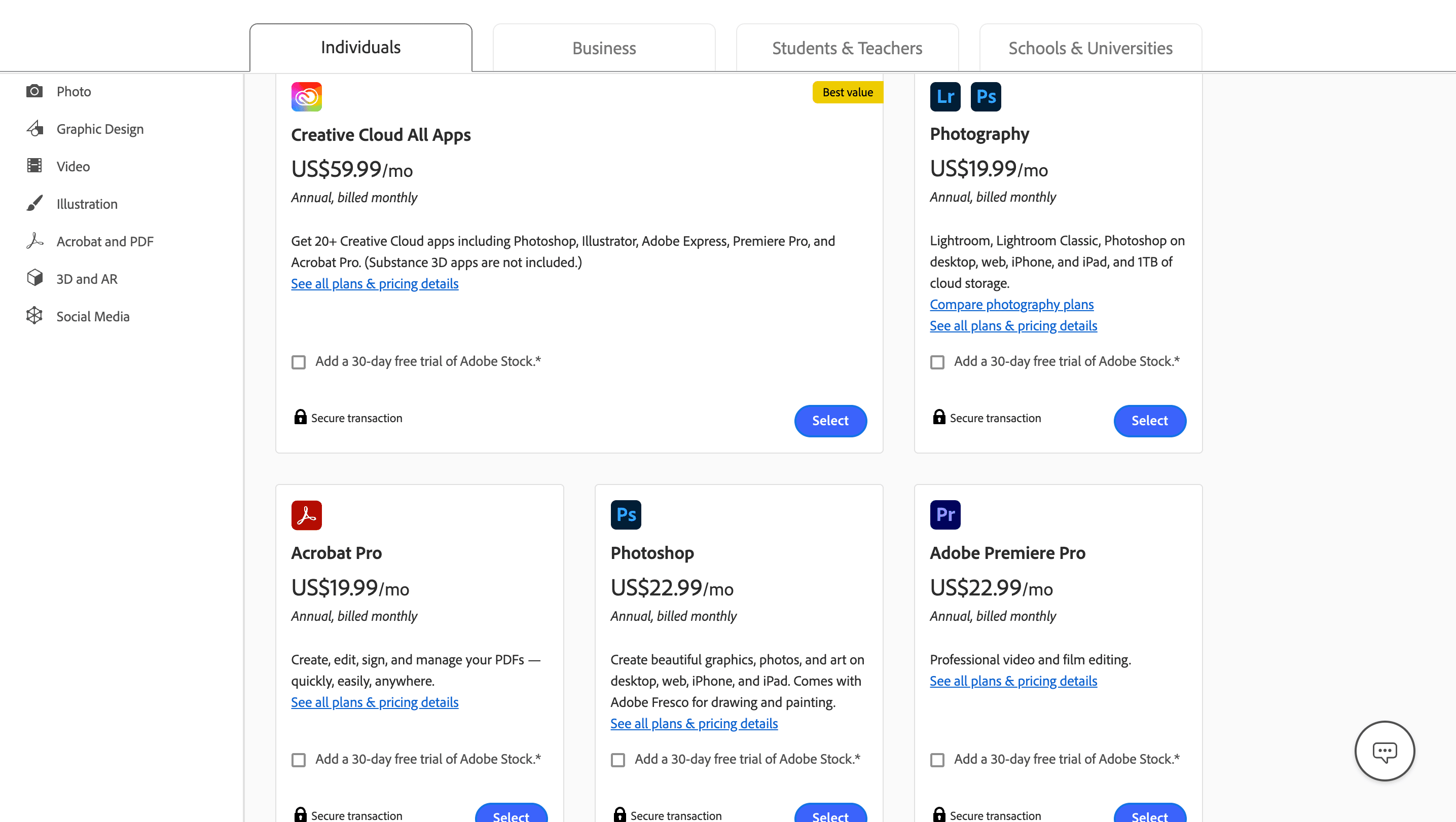
Adobe’s pricing strategy reflects a strong SaaS approach built on clarity, customization, and user trust. The pricing page is structured to support a wide range of users—from individual creatives to enterprise-level teams—making it easy to find and compare options.
Multiple Plan Types: Adobe offers distinct plans for Individuals, Photographers, Students & Teachers, Businesses, and Schools. Each category is clearly marked, helping users quickly navigate to the different plans that fit their profile.
Straightforward Tiering: Within each plan type, Adobe provides clear tiers with listed features and included apps (e.g., Photoshop, Illustrator, Premiere Pro). Users can see exactly what tools they’re paying for, reducing confusion and decision friction.
Interactive Pricing Toggles: The pricing page includes toggles to compare monthly payments vs. annual payments and annual billing. It automatically shows users how much they’ll save with yearly commitments, encouraging longer-term sign-ups through visible value.
Transparent Cost Breakdown: Every plan includes a per-month cost and full breakdown of what’s included—no hidden fees or vague descriptions. This openness builds user confidence.
Upgrade Encouragement: Adobe highlights the added benefits of higher-tier plans in side-by-side comparisons, making it easy for users to assess the value of upgrading.
#3 Slack - User-Friendly Layout with Clear CTA
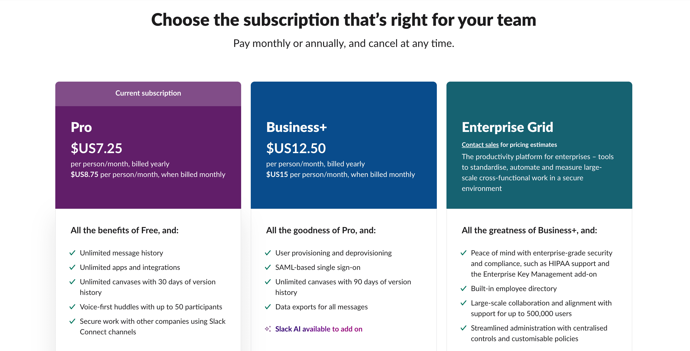
Slack’s pricing page is a model of effective SaaS design—focused on clarity, ease of comparison, and building user trust from the first click.
Clean Layout: A straightforward design with a comparison table makes it easy to scan all plans side by side. Users can quickly understand what each tier offers without digging through extra pages.
Prominent CTAs: Buttons like “Start for Free” and “Explore Features” are placed strategically, using standout colors that guide action while staying on-brand. This encourages fast engagement and smooth conversions.
Flexible Billing Options: Users can toggle between monthly and annual pricing, with savings for longer commitments clearly displayed—helping teams budget more effectively.
Effective Use of Space: Ample white space and a clean visual hierarchy keep the page from feeling crowded, making it easy to digest key information at a glance.
Security Front and Center: Slack highlights its security features directly on the pricing page, which builds immediate trust for businesses evaluating collaboration tools.
#4 Zoom - Effective Use of Testimonials and Trust Signals
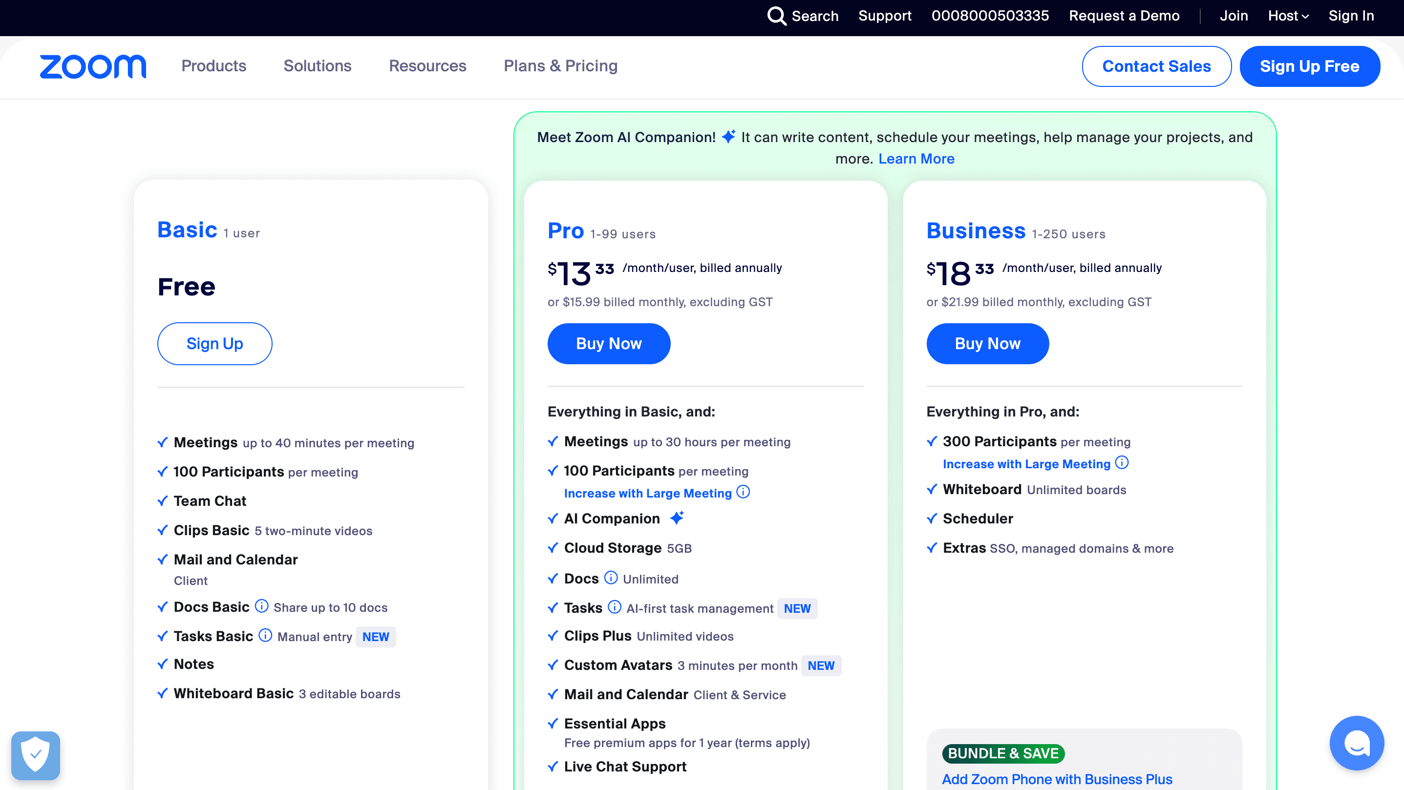
Zoom’s pricing page uses social proof and smart design to build trust and guide users toward confident decisions.
Strategic Social Proof: Customer testimonials, top ratings, and certifications are displayed prominently to establish credibility and reduce hesitation for new users.
Plan Grouping by Use Case: Pricing is organized by SaaS product type (e.g., Zoom Meetings, Zoom Business), helping users quickly find the right fit based on team size and purpose.
Visual Feature Highlights: Icons and short descriptions make it easy to scan the key features of each plan without overwhelming the viewer.
Free Trial Promotion: The free trial offer is clearly visible and reinforced with additional social proof, encouraging hesitant users to try Zoom with no risk.
#5 HubSpot - Interactive Pricing Sliders
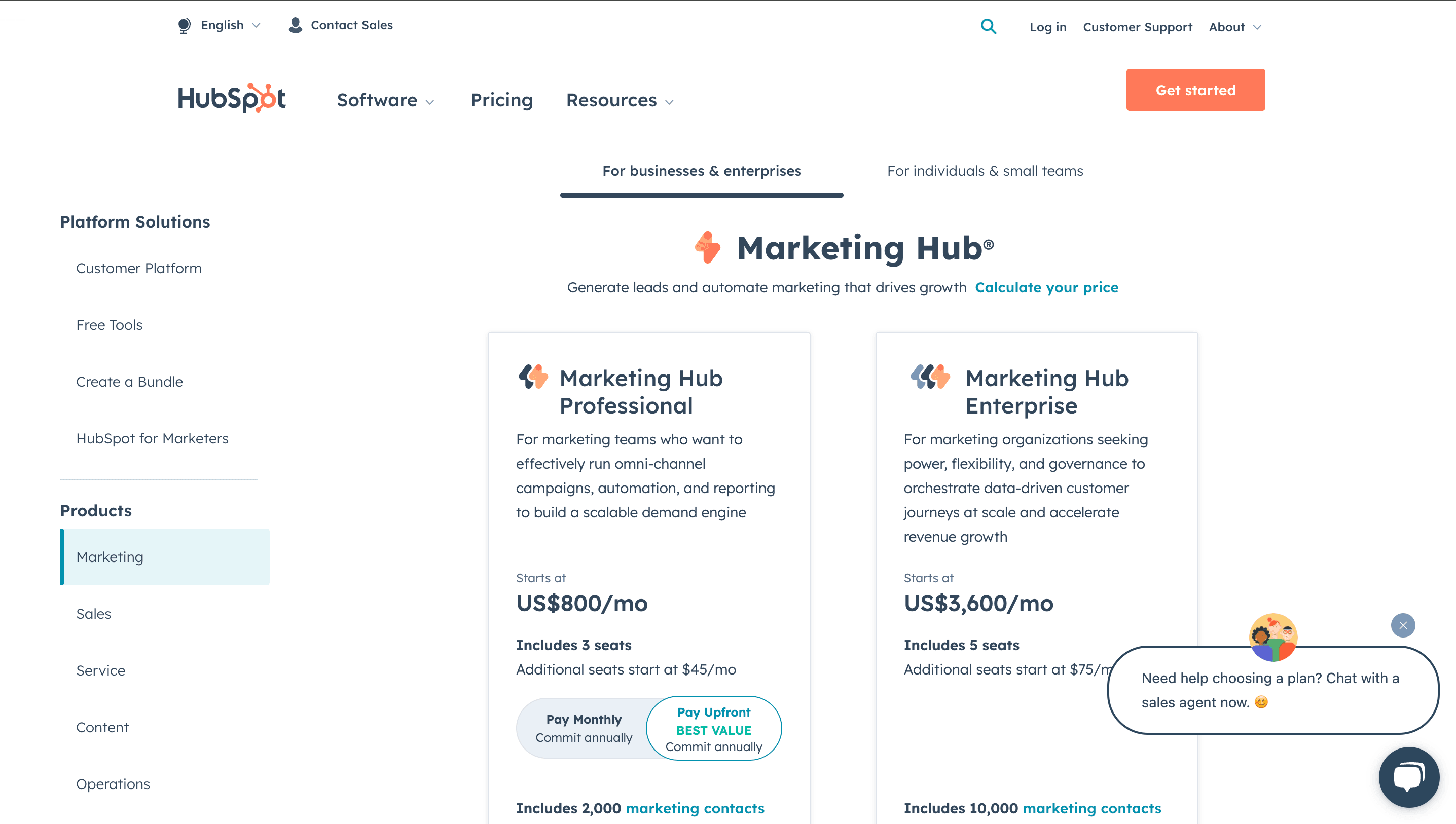
HubSpot’s pricing page stands out by offering a dynamic, user-tailored experience that simplifies complex SaaS options and guides users toward informed decisions.
Interactive Sliders: Users can adjust variables like team size or subscription length, with real-time price updates reflecting various price points. This personalization, in collaboration with the sales team, makes pricing feel tailored and transparent.
Clear Tool Grouping: Solutions are organized into categories like CRM, Marketing Hub, and Service Hub, helping users quickly locate the tools they need.
Tier Descriptions with Key Features: Each pricing tier includes detailed, benefit-focused descriptions showing different features, along with detailed descriptions of how users can easily compare what’s included and choose based on real value.
Recommended Plan Highlight: A clearly marked “most popular” or recommended middle-tier plan helps undecided users make quicker, more confident decisions.
Side-by-Side Comparisons: Interactive comparison tools let users stack up features and usage limits across plans, making differences easy to understand at a glance.
User-First Design: The layout, customization options, and helpful guidance show HubSpot’s commitment to making pricing clear for businesses at any scale.
#6 Asana - Detailed Comparison Tables
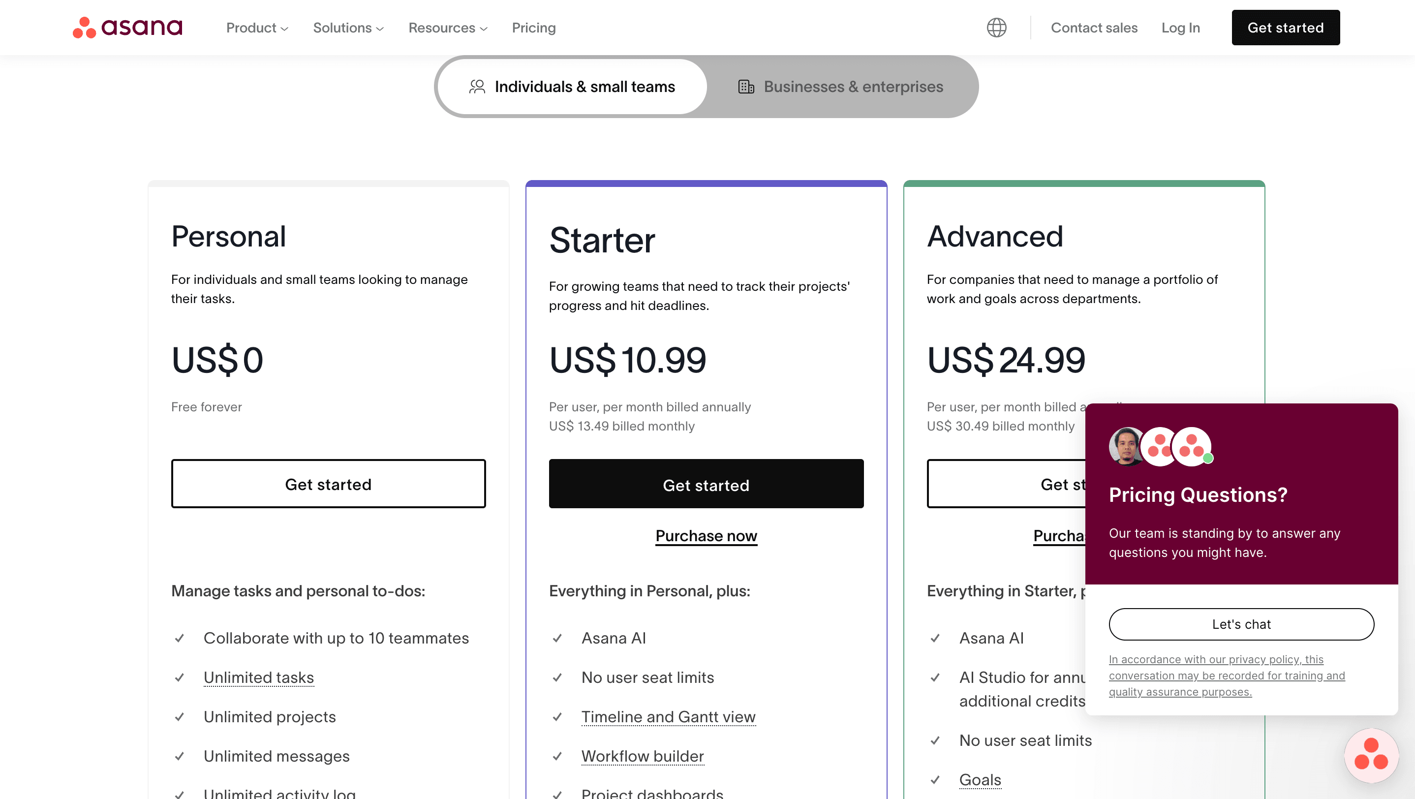
Asana’s pricing page is built for clarity and quick decision-making, using a clean layout and simple comparison tools to guide users.
Clear Comparison Tables: Features for each tier—Free, Premium, and Enterprise—are listed side by side, making it easy to spot differences without digging through extra pages.
Tier Breakdown:
Free – Ideal for individuals and small teams with basic task and project tracking.
Premium – Great for growing teams, offering unlimited dashboards and integrations.
Enterprise – Designed for large organizations needing security controls and advanced customization.
Dropdown for Details: Users can expand sections to dive deeper into each plan’s features, keeping the page clean while still offering depth.
Simple Navigation: Switching between tiers is smooth, with well-organized layouts and quick-access info.
Strong CTAs: Buttons like “Start Free” encourage immediate action and lower the barrier for new users.
Social Proof: Real testimonials add trust and credibility, helping hesitant visitors feel confident in their choice.
#7 Mailchimp - Highlighting Feature Accessibility at Various Tiers
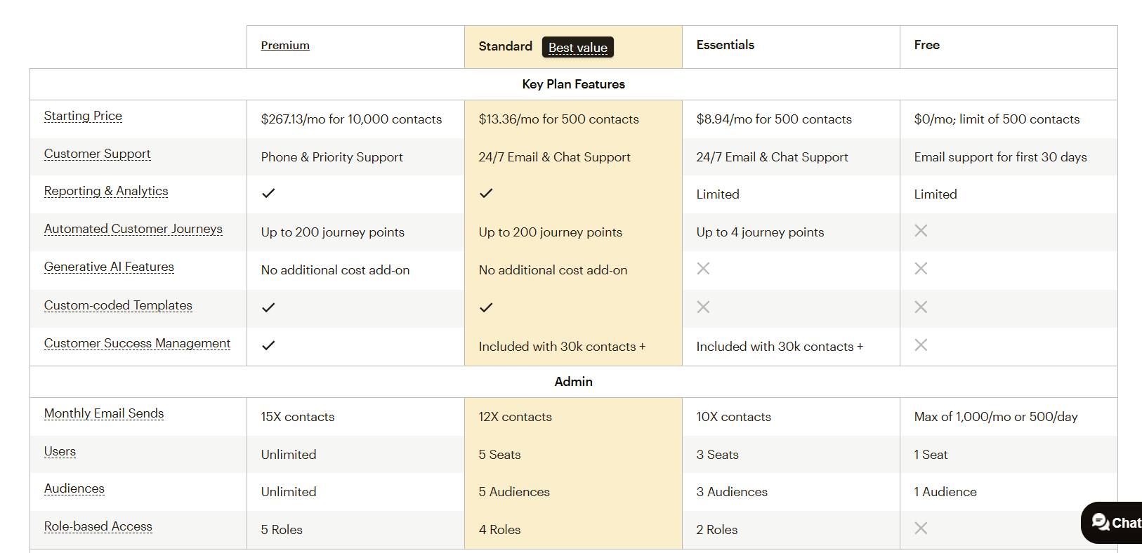
The pricing page of Mailchimp, an email marketing tool, is built to help users make fast, confident choices through clean design, smart recommendations, and trust signals.
Clear Feature Breakdown: Each pricing tier, including the Free plan, is outlined with key features, so users can quickly see what they get at every level—from Free to Premium.
Recommended Plan Highlight: The Standard plan is marked as the best value, guiding users toward a balanced option without needing to compare endlessly.
Plan Matching Tool: Mailchimp suggests the right plan based on team size or needs, removing guesswork and speeding up the decision process. This enhances the pricing page layout for better user experience.
Expandable Details: Dropdown menus let users dive deeper into specific features or usage limits without cluttering the layout.
Awards and Trust Badges: Prominently displayed certifications and accolades build instant credibility with new users.
Helpful FAQs: A dedicated section answers questions about billing, platform use, and setup, reducing friction for first-time buyers.
User-First Design: Every element of the page is built for usability—clear copy, intuitive layout, and features that enhance the overall experience.
#8 Google Workspace - Seamless Navigation Through Pricing Plans
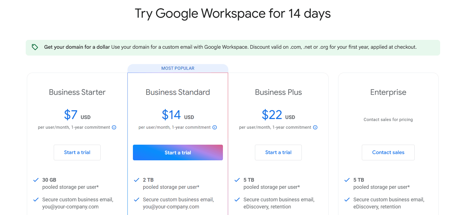
Google Workspace uses a clean, intuitive pricing layout that simplifies decision-making for individuals, teams, and businesses of all sizes.
Upfront Pricing Table: Key pricing information is placed at the top of the page, allowing users to find what they need immediately without scrolling.
Segmented Plans for Individuals and Teams: Separate options cater to solo users and businesses, making the experience feel personalized and relevant.
Visual Feature Icons: Each tool or feature is paired with an icon, helping users scan and understand capabilities quickly.
Interactive Toggles: Users can switch between monthly and annual billing or compare features across plans side by side, making comparisons quick and clear.
Annual Discount Incentives: Transparent savings are shown for annual billing, encouraging longer-term commitments with upfront value.
Add-Ons and Bestsellers Highlighted: Optional extras and popular plans are clearly labeled, guiding users toward the most relevant or widely adopted choices.
Also read: Winning Product Marketing Framework for SaaS Business Growth
What Are The 5 Smart Design Elements That Boost SaaS Pricing Page Conversions?
SaaS pricing page design choices and best practices are key to making SaaS pricing pages effective. Visual order, smart typography, color use, cost savings, and CTA placement all play a role in user engagement and conversions. Here's a streamlined breakdown:
1. Clear Plan Differentiation
Visually separate pricing tiers using cards or columns. Use bold plan names, feature checklists, and a highlighted "Most Popular" badge to guide the user naturally toward your key offering.
2. Clean, Legible Pricing
Keep the price front and center with large fonts. Offer a toggle for monthly vs. annual billing, and make savings obvious with clear messaging like "Save 20% annually."
3. Focused Feature Comparison
Use a simple, mobile-friendly comparison table. Add tooltips to clarify technical features and use icons to enhance scannability.
4. Trust and Risk Reduction
Include trust signals like customer logos, testimonials, security badges, and refund policies near the pricing section to reduce hesitation and build confidence.
5. Strategic Call to Action
Use strong, action-oriented CTAs like “Start Free Trial” or “Get Started” on every plan. Make buttons visually distinct and reinforce urgency or value (e.g., “No credit card required”).
Conclusion
The way you design an effective SaaS pricing page has a big impact on how you attract potential customers and boost sign-ups. By looking at the best examples from top companies, you can see which parts really help improve user experience. Be sure to use transparency on your pricing page, show some creativity, and add clear CTAs. This will help people feel sure about what your service offers and guide them to make a choice. Remember, you need the page to look good but also work well, so people are not confused.
As you update your own saas pricing page, think about these design ideas and see what your audience likes most. Try out new things, because the best results come from testing what works for you. If you want help getting your saas pricing page to the next level, get a free consultation with our experts today!
Frequently Asked Questions
What are the must-have elements on a SaaS pricing page?
Some must-have things for startups are detailed pricing tables, clear CTAs, free trial offers, and a strong FAQ section. The best part is these help people look at the plans, compare the features, and take action. This way, they can get what they need and not have any questions left when they use the FAQ or see the pricing and other info.
How often should SaaS pricing pages be updated?
SaaS pricing pages need to be updated often as part of effective SaaS marketing. This helps you keep up with new market trends and listen to what people who use your service are saying. When you check on how the pricing is doing, you make sure it stays clear, open, and matches what people want or need as things change. Updating your SaaS pricing can help your business do well and keep your users happy.
What makes a pricing page design user-friendly?
User-friendly designs put focus on easy navigation. The layouts look nice and you get clear, short information. Things like dropdown menus, interactive sliders, and sections that expand help people make choices without trouble. These features be good for those who need to decide what to do next.
Can design elements affect the conversion rates on pricing pages?
Yes, design parts have a direct effect on conversion rates. They help get people engaged. Things like visual order on the page, how colors make people feel, and where you put easy-to-see CTAs all help. These parts make the buying process smooth. They also help cut down on the number of people who leave the site too soon.
Leveraging Analytics to Improve Pricing Page Performance
Analytics tools watch how people act on your pricing page. They look for patterns to help your pricing work better. You can check things like high bounce rates, how many people leave the page, or how much they interact with it. This helps you make your page design better and make sure your pricing meets your goals for growth. Using analytics, it is easier to see what works and change what does not for your pricing to get good results.
Tools and Methods for Tracking User Interaction on Pricing Pages
Tools like Google Analytics or Hotjar help you watch how people use your site. They track things like engagement and click-through rates. With this information, businesses can change their content and blog layout to get more sales or sign-ups.
Comments
Your comment has been submitted