By Robin Singhvi · Founder, SmartCue · Updated April 29, 2026
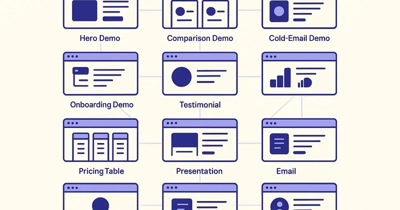
Most "interactive demo examples" posts you'll find online are screenshot galleries dressed up as content. They show you 10 demos, gush about how each one is "engaging," and never tell you which one is right for which job in your funnel.
This isn't that.
This post is 12 examples organized by the funnel position each one earns its keep in. For every example I'll name the funnel stage, the buyer it serves, the structural pattern that makes it work, and the common mistakes I see when teams try to copy the format without copying the underlying decisions. By the end you should know which kind of demo to build for each surface in your funnel — not just which demos look pretty.
The examples below are drawn from patterns across the 4,000+ teams running on SmartCue. Personify Health (formerly Virgin Pulse), Creditsafe, OneDigital, League, Quisitive, and Dario Health all run variants of the formats below. Anonymized where the example is composite; named where it's a public reference.
If you haven't yet read What Is an Interactive Demo? — that's the architecture post. This is the catalogue.
How to read this post
Each example is structured the same way:
- Funnel stage — where in the buyer journey it lives
- Buyer — who it's built for
- Structural pattern — what makes the format work
- Length — typical step count
- Best embedded on — distribution surfaces it fits
- Common mistake — how teams break it
- When NOT to use this format — the line where another format wins
Pick the examples that match your current funnel gaps. If your homepage has a "schedule a demo" button and no embedded demo, start with example #1. If your sales team's cold-email reply rate is below 3%, start with example #5.
Top of funnel: awareness and curiosity
Example 1 — The 60-second homepage hero demo
Funnel stage: awareness → engagement
Buyer: any first-time visitor to your homepage
Structural pattern: 6-8 step linear walkthrough of the single most-impressive feature, no branching, no lead-gate, embedded above the fold or right below it. Auto-loop or large-CTA-to-start.
Length: 6-8 steps, ~45-60 seconds end to end
Best embedded on: homepage, product-overview pages, paid-ad landing pages
Common mistake: trying to show 5 features in 12 steps. The hero demo's job is to make the visitor want to see more, not to explain everything. Pick the one feature that's most surprising and lead with it.
When NOT to use this format: if your product is genuinely too complex to demo in 60 seconds (rare, but real for highly-technical infrastructure), use a 30-second video paired with a deeper interactive demo on a sub-page.
Example 2 — The category-explainer demo
Funnel stage: awareness
Buyer: prospects new to your category, not just your product
Structural pattern: 8-10 step linear walkthrough that frames the category problem in steps 1-3 before introducing your product as the solution in steps 4-10. Heavy on captions; lighter on UI clicks.
Length: 8-10 steps, ~90 seconds
Best embedded on: "What is X" landing pages, category-keyword content, top-of-funnel paid landing pages
Common mistake: assuming the visitor knows the category. If you're selling demo automation software to a buyer who's never heard of demo automation, your example #1 hero demo will confuse them. The category-explainer fills that gap.
When NOT to use this format: when your category is well-understood (e.g., "email marketing software") — skip straight to example #1.
Top-mid funnel: evaluation kicks off
Example 3 — The feature-deep-dive demo
Funnel stage: evaluation
Buyer: visitors actively comparing your product against competitors
Structural pattern: 10-15 step demo focused on a single high-impact feature. Detailed captions explaining the why, not just the how. Includes 1-2 "look at this specific moment" highlights.
Length: 10-15 steps, ~2-3 minutes
Best embedded on: /features/X pages, product-tour landing pages, blog posts that link from category content
Common mistake: turning the deep-dive into a demo of the entire product. The deep-dive's value is in showing one thing well, not everything badly.
When NOT to use this format: for buyers who already know what your product does and just want to see it run end-to-end (use example #4 instead).
Example 4 — The full-product walkthrough demo
Funnel stage: evaluation
Buyer: mid-funnel prospects who want to see the product end-to-end before committing to a sales conversation
Structural pattern: 15-25 step demo that walks through the full primary use case from sign-up to outcome. Branching at one decision point ("which use case fits your team?"). Lead-gate at step 8-10 to qualify the viewer before showing the second half.
Length: 15-25 steps, ~4-6 minutes
Best embedded on: /demo or /product-tour landing pages, mid-funnel email sequences
Common mistake: putting the lead-gate too early (step 1-3). Buyers will bounce. Show value first; ask for the email after they've seen enough to want more.
When NOT to use this format: for first-touch website visitors (use example #1 — they're not ready to commit yet).
Mid funnel: the deal heats up
Example 5 — The cold-email follow-up demo
Funnel stage: outbound and follow-up
Buyer: recipients of cold outreach from sales teams
Structural pattern: 5-7 step demo customized to the prospect's likely use case. The first step is a personalized greeting card ("Hey [Name], here's how [Their Industry] teams use [Product]"). Lead-gate optional — usually skipped because the recipient is already known.
Length: 5-7 steps, ~30-60 seconds
Best embedded on: outbound email body (as a sharable link), LinkedIn DMs, follow-up sequences
Common mistake: sending the same demo to every cold-email recipient. Personalization is the whole point of this format — generic cold-email demos perform worse than no demo at all because they signal mass-outreach.
When NOT to use this format: for inbound leads (they didn't ask for a personalized greeting; treat them with example #4).

Example 6 — The discovery-call leave-behind demo
Funnel stage: post-discovery, pre-decision
Buyer: prospects who have already had a 30-minute discovery call and need something to share internally
Structural pattern: 12-18 step demo with branching by stakeholder (CFO sees ROI framing; Director of Operations sees workflow framing; CTO sees integration framing). Sent as a sharable link in the post-call email.
Length: 12-18 steps, ~3-5 minutes
Best embedded on: sales follow-up emails, deal-stage CRM emails
Common mistake: treating this like example #4 (full-product walkthrough). The discovery-call leave-behind needs to be more specific — the AE just had a 30-minute conversation and knows what the prospect cares about. The demo should reflect that.
When NOT to use this format: when no discovery call has happened yet — use example #4 instead.
Example 7 — The persona-routed comparison demo
Funnel stage: active vendor comparison
Buyer: prospects evaluating you against 2-3 named competitors
Structural pattern: Same demo source, three persona variants. Each variant emphasizes the dimension that persona cares most about. URL parameters or first-step persona-selector route the viewer.
Length: 8-12 steps per variant, ~90 seconds-2 minutes per variant
Best embedded on: /vs-competitor landing pages, /alternatives pages, comparison-keyword content
Common mistake: writing one neutral demo and putting three different headlines on it. The variants need to actually differ at the step level — different highlights, different CTAs, different copy. Otherwise the personalization is theater.
When NOT to use this format: when you have low traffic to comparison pages — start with example #4 first.
Bottom funnel: closing
Example 8 — The procurement-evidence demo
Funnel stage: late deal stage, procurement review
Buyer: technical or financial buyers evaluating whether the product does what sales claimed
Structural pattern: 15-20 step demo of the specific feature set procurement is asking about, with explicit captions that map to the procurement checklist items. No marketing copy. Functional and detailed.
Length: 15-20 steps, ~5-8 minutes
Best embedded on: late-stage emails, procurement/security review packets, deal-room documents
Common mistake: styling this demo like a marketing asset. Procurement reviewers want concrete, specific, boring proof. Shiny captions and animation cues read as evasion.
When NOT to use this format: earlier in the funnel — buyers who haven't yet decided you're a finalist won't engage with this level of detail.
Example 9 — The pricing-and-ROI demo
Funnel stage: late evaluation
Buyer: prospects who like the product but are weighing cost
Structural pattern: 8-12 step demo that integrates pricing tiers and ROI calculation directly into the walkthrough. Final 2-3 steps are the "what does this look like at your scale?" cost calculator.
Length: 8-12 steps, ~2-3 minutes
Best embedded on: /pricing pages, late-stage sales emails, deal-stage CRM emails
Common mistake: burying the price. If a buyer is at this stage, they want the number. Show it clearly in the demo, not in a separate document.
When NOT to use this format: earlier in the funnel (price reveals can spook prospects who haven't yet seen value).
Post-sale: onboarding and adoption
Example 10 — The pre-kickoff onboarding demo
Funnel stage: post-purchase, before kickoff call
Buyer: new customer team members who will use the product
Structural pattern: 10-15 step linear walkthrough of the core "first hour with the product" experience. No marketing copy. Practical instructions: "click here to do X."
Length: 10-15 steps, ~3-4 minutes
Best embedded on: customer onboarding emails, product welcome flow, customer help center
Common mistake: assuming new customers will figure it out. Post-purchase, the buyer-to-user transition is a dropoff point. The pre-kickoff demo compresses ramp time.
When NOT to use this format: if your product onboarding is genuinely complex enough to need a live kickoff call (still ship the demo as supplementary).
Example 11 — The feature-launch adoption demo
Funnel stage: existing-customer adoption
Buyer: existing customers who haven't yet adopted a newly-released feature
Structural pattern: 6-10 step demo of the new feature, with a 2-step "before/after" framing showing what changed. Sent in feature-launch emails to the customer base.
Length: 6-10 steps, ~90 seconds
Best embedded on: product-update emails, in-app notification banners, help-center release-notes
Common mistake: ignoring the launch. Most SaaS teams ship feature releases via email + product-tour notification and call it adoption. A 90-second interactive demo of the new feature lifts adoption meaningfully — and tells you (via step-level analytics) which sub-feature actually got tried.
When NOT to use this format: for tiny UX tweaks (changelog text is fine).
Example 12 — The renewal-recap demo
Funnel stage: pre-renewal, customer retention
Buyer: customer-side stakeholders making the renewal decision
Structural pattern: 8-12 step demo that recaps the value the customer extracted in the past 12 months — features used, outcomes generated, comparison to baseline. Sent in the renewal-quote email.
Length: 8-12 steps, ~2-3 minutes
Best embedded on: renewal-quote emails, executive business review (EBR) packets
Common mistake: generic "thank you for being a customer" framing. The renewal-recap should be specific — usage numbers, outcomes generated, ROI signals. If you don't have this data, build the measurement first; don't fake it in the demo.
When NOT to use this format: for customers in churn-risk territory (they need a CSM call, not a demo).

What good demos share across the 12 formats
Looking across all 12 examples, the patterns that show up in the high-performing demos in the SmartCue customer base:
- They're shorter than you think. Median demo on the platform has about 12 steps. The 25-step demos exist but are rarer. Length isn't quality.
- They use captions like product copy, not blog copy. Crisp, specific, declarative. "This step exports the report as PDF" — not "Here, you'll be amazed at how easy our export is."
- They have one CTA, not five. Multiple CTAs split viewer attention. Pick one. Make it specific.
- They lead-gate based on funnel stage, not always. Top-of-funnel: no gate. Mid-funnel: optional gate. Bottom-funnel: gated. Post-sale: never gate.
- They get updated when the product changes. Stale screenshots are the #1 reason demos lose effectiveness over time. Refresh quarterly at minimum.
- They have step-level analytics turned on. If you can't tell where viewers drop off, you can't improve the demo.
Templates for each format
The fastest way to ship one of the 12 formats is to start from a template that already has the structural pattern wired up:
- Hero demo template (Example #1) — preset for 60-second top-of-funnel embed
- Cold-email demo template (Example #5) — preset for personalized outbound
- Discovery-leave-behind template (Example #6) — preset for post-call follow-up
- Persona-routed comparison template (Example #7) — preset for /vs-competitor pages
- Procurement-evidence template (Example #8) — preset for late-stage technical review
- Pre-kickoff onboarding template (Example #10) — preset for new-customer onboarding sequences
- Feature-launch template (Example #11) — preset for in-app and email release announcements
Templates available inside the SmartCue editor at app.getsmartcue.com — pick the format closest to your funnel gap, customize the steps, ship.
Common patterns to AVOID
The five anti-patterns I see most often in demos that underperform:
Anti-pattern 1: The "everything tour." A 30-step demo that touches every feature in the product. Reads as a team that didn't know what to highlight, so they showed everything. Almost always underperforms a focused 8-step demo.
Anti-pattern 2: The over-narrated demo. Captions on every step explaining what the obvious-from-the-screenshot UI is doing. Trust the screenshot; only caption the why and the surprising bits.
Anti-pattern 3: The "schedule a demo" CTA inside an interactive demo. Mixed message — the buyer is already engaging with a demo. Asking them to schedule another one signals you don't trust your interactive demo to do its job. Use a different CTA.
Anti-pattern 4: The branching maze. 5+ persona variants, 3 funnel-stage variants, 4 channel variants — the matrix is unmaintainable. Most teams hit a sweet spot at 2-3 persona variants and 2 funnel-stage variants. More than that, the maintenance cost outpaces the personalization benefit.
Anti-pattern 5: The forgotten demo. Built once, embedded once, never updated. The product UI changes, the demo screenshots don't, the demo eventually becomes a liability. Refresh cadence is part of the workflow — not optional.
Frequently asked about interactive demo examples
Which example should I build first?
The one that fixes your biggest funnel gap. If you have no homepage demo: example #1. If sales reply rates are low: example #5. If new-customer time-to-first-value is slow: example #10. The point is to fill a gap, not to build a portfolio.
How long does each format take to build?
Typical first-time build: 60-120 minutes including capture and editing. By format #5 your team builds it in 30-45 minutes. The full step-by-step is in How to Create an Interactive Product Demo.
Do I need a different platform for each format?
No. All 12 formats run on the same interactive demo platform. The differences are in the structural decisions (length, branching, lead-gate placement, distribution surface), not in the underlying tooling.
Can I A/B test formats?
Yes. The most-effective A/B test is comparing example #1 (linear hero) vs example #4 (full walkthrough with branching) on your homepage. Whichever produces more downstream meeting bookings is the right format for your funnel.
What's the right step count?
Format-dependent (see each example above). In aggregate, the median demo on SmartCue has about 12 steps, which lines up with most use cases. The outliers — 6 steps for cold email, 25 steps for procurement — are exceptions for specific surfaces.
How often should I refresh demos?
At minimum, quarterly — tied to your product release cycle. If you ship UI changes more often, refresh more often. Most demo platforms (SmartCue included) flag demos with screenshots older than 90 days.
Do these formats work for non-SaaS products?
The formats are SaaS-shaped because the buyer journey is. Hardware and services products have different funnel patterns — adapt the formats to the actual buyer surfaces in your category.
What if my product is too complex for any of these formats?
It probably isn't. The teams I see struggle with "our product is too complex" usually have demos that try to explain the entire product instead of one job at a time. Pick a job, build a demo for that job, repeat for the next job. The complexity is in the catalogue, not in any single demo.
Related reading
- What Is an Interactive Demo? — the architecture post
- What Is Demo Automation? — the workflow that produces these examples
- How to Create an Interactive Product Demo — the build walkthrough
- Demo Automation Playbook — the 90-day rollout
- What Is SmartCue? — the platform behind these examples
Build any of the 12 formats in 6 minutes — sign up free at app.getsmartcue.com or see pricing →.