How To Drive Feature Adoption Through Apps Walkthrough?
TL;DRThink of in-app walkthroughs as your app’s personal tour guide—walking users through core features and smoothing out tricky workflows. Triggered at just the right moments (onboarding, new feature launches, or signs of confusion), they turn “where do I click?” into “oh, I get it!” in seconds. The payoff? Users stick around longer, explore more, and convert faster. Done right, these walkthroughs accelerate product growth, streamline onboarding checklists, and move users further down the buyer’s journey without friction. |
Imagine this: A new user downloads your app, full of excitement.
They tap… swipe… pinch… zoom… and then stare at the screen like it’s a puzzle.
One minute later, they sigh, whisper “I’ll just use the website,” and vanish.
The harsh truth? Even the smartest apps lose users when people can’t figure out what to do next.
That’s where in-app walkthroughs come to the rescue, your friendly, step‑by‑step guide that says,
“Hey, here’s how to actually enjoy this app without rage‑quitting.”
With a good walkthrough, users see value faster, stick around longer, and start exploring features you worked so hard to build.
What is In App Walkthrough?
In-app walkthroughs are interactive, step-by-step guides that highlight your app’s core features, workflows, and hidden features. They boost onboarding, drive feature adoption, reduce churn, and improve user engagement by delivering contextual guidance that quickly leads users to their “aha” moment.
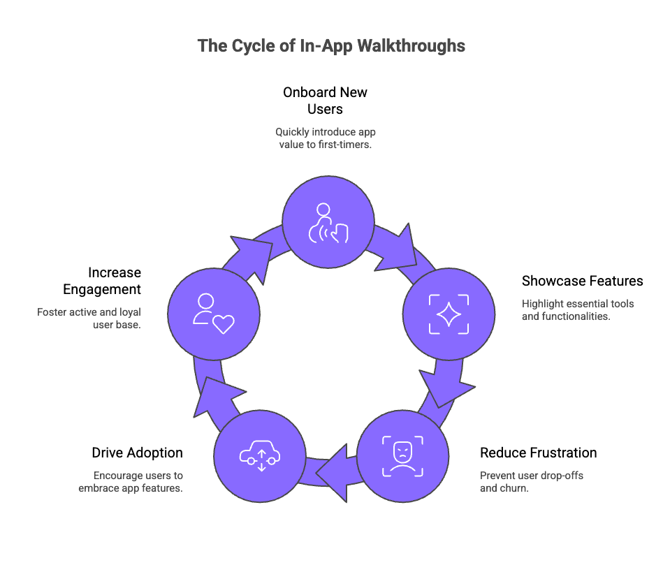
Instead of dropping users into a “figure it out yourself” maze, walkthroughs shorten the product adoption curve by:
Onboarding new users quickly – Helping first-timers understand the value of your app in seconds.
Showcasing must-know features – Ensuring users don’t miss the tools that make your app shine.
Reducing user frustration and churn – Turning potential drop-offs into engaged, loyal users.
But here’s the real magic for how to make an app walkthrough video: they aren’t just tutorials, they’re strategic.
They guide users toward the actions and features that drive adoption, engagement, and conversions. By the time a user completes a walkthrough, they’ve already experienced your app’s value firsthand, which is far more powerful than any marketing message.
In short, an in-app walkthrough doesn’t just explain your app, it transforms casual downloaders into confident, repeat users.
Why Is An App Walkthrough Tutorial Needed for Your Product’s Success?
A great product isn’t enough if users can’t unlock its value quickly.
When users hit your app for the first time, they’re gone within minutes, or even seconds. With 25% bouncing after a single use and 40–60% never returning beyond their first login (source), your app needs to prove value instantly. That’s where in-app walkthrough videos step in, by delivering “aha” moments rapidly, boosting engagement significantly, and helping prevent immediate churn.
Let’s break down why an interactive walkthrough is now a critical growth lever for any digital product:
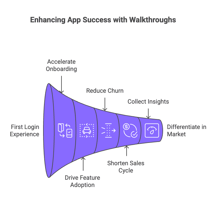
1. Accelerate Onboarding and Reduce Cognitive Load
The first login experience is make-or-break. If your app feels overwhelming or unintuitive, users bounce.
Walkthroughs simplify complex workflows into short, digestible steps. For example:
Highlighting only the next actionable step instead of dumping all features at once
Using progress indicators to show users they’re moving forward
Incorporating tooltips and micro-interactions to guide without distracting
A smooth onboarding means users start seeing value faster, which directly improves activation rates.
2. Drive Feature Adoption and Product Stickiness
Even the best features go unused if users don’t know they exist. In-app walkthroughs ensure your key value drivers, whether it’s a dashboard, integration, or automation, don’t get lost in the UI.
Advanced teams use:
Contextual walkthroughs that trigger only when a user reaches a relevant screen
Interactive hotspots instead of static instructions
Multi-path flows for different user personas (newbie vs. power user)
The result? Users explore beyond the surface, leading to higher adoption and better product stickiness.
3. Reduce Churn by Eliminating Friction
Interactive Walkthrough software acts as a safety net:
Guide users past confusing steps or empty states
Surface quick wins that reinforce your app’s value
Reduce dependency on support tickets for basic onboarding
Every friction point removed is one less reason for a user to leave.
4. Shorten the Sales and Trial-to-Paid Cycle
When your app demonstrates value instantly, users are more likely to convert from free trial to paid plans.
B2B SaaS teams use walkthroughs to:
Fast-track proof of value during product demos
Highlight premium features strategically without hard selling
Integrate Call-To-Actions (CTAs) like “Enable Integration” or “Invite Team” right in the walkthrough
A shorter learning curve translates into faster revenue generation.
5. Collect Behavioral Insights to Optimize Product and Marketing
Modern in-app walkthrough tools track every click, skip, and completion. This data reveals:
Which features users engage with first
Where they drop off in the onboarding flow
Which CTAs drive the highest conversions
You can use these insights to refine product UX, adjust messaging, and optimize marketing campaigns for maximum impact.
6. Differentiate in a Crowded Market
With hundreds of competitors in every category, user experience is your silent salesperson.
Custom, interactive walkthroughs that feel intuitive and on-brand instantly set you apart. They do the following:
Make your app memorable from the first touchpoint
Deliver a tailored experience for different user segments
Reduce the learning curve so competitors feel “harder” by comparison
In short, a delightful walkthrough experience = higher retention + stronger brand perception.
When to Use App Walkthrough Screens (Contexts & Triggers)?
Not every moment in your app requires a walkthrough, but the right triggers can make the difference between a frustrated drop-off and a delighted user.
App walkthroughs are most effective when they anticipate user confusion, introduce new value, or guide critical actions.
Here are the key contexts and triggers to consider:
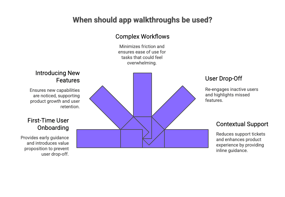
1. First-Time User Onboarding
Context: When new customers open your app for the first time.
Trigger: Launching from the welcome page or sign-up completion.
Why: Early guidance creates a good start, introduces the value proposition, and prevents users from bouncing due to uncertainty.
Example: A project management tool guiding first-time users through creating their first project and assigning tasks.
2. Introducing New Features
Context: After shipping updates or rolling out additional functionalities.
Trigger: Users land on a page with new features or visit a specific feature for the first time.
Why: Ensures new capabilities don’t go unnoticed, supporting product growth and user retention.
Example: A productivity app using a quick interactive guide with a “Try it now” CTA for its fresh calendar sync option.
3. Complex or High-Value Workflows
Context: Features that require multiple steps, configurations, or dependencies.
Trigger: Users enter a sequence of steps or attempt an advanced workflow.
Why: Minimizes friction, drives user engagement, and ensures ease of use for tasks that could otherwise feel overwhelming.
Example: An analytics platform walking users through setting up their first dashboard with a step-by-step interactive guide.
4. User Drop-Off or Inactivity
Context: When behavioral data signals that users are stuck, hesitant, or inactive.
Trigger: Idle time, repeated errors, or returning after a long gap.
Why: Contextual walkthroughs can re-engage users and highlight specific features they might have missed.
Example: A fitness app nudging inactive users with a mini walkthrough to create a personalized workout plan.
5. Contextual Support Without Friction
Context: Users show signs of needing help but haven’t reached out to customer support tools yet.
Trigger: Hovering over certain UI elements, visiting help sections, or A/B testing reveals common confusion points.
Why: Providing inline guidance reduces support tickets and enhances the product experience.
Example: A design tool displaying a short tooltip sequence when a user struggles to apply a new template.
How to Create An App Walkthrough Using SmartCue to Increase Conversions?
We learned the hard way that even the smartest features can go unnoticed if users don’t know where to start. That’s why we built SmartCue, to make creating in-app walkthroughs effortless and effective.
“I came up with SmartCue because I couldn’t find the right tool to do what I needed to do, back when I was a very frustrated and overworked Sales Engineer.” |
|---|
Here’s exactly how we craft walkthroughs that help apps shine, and users stick.
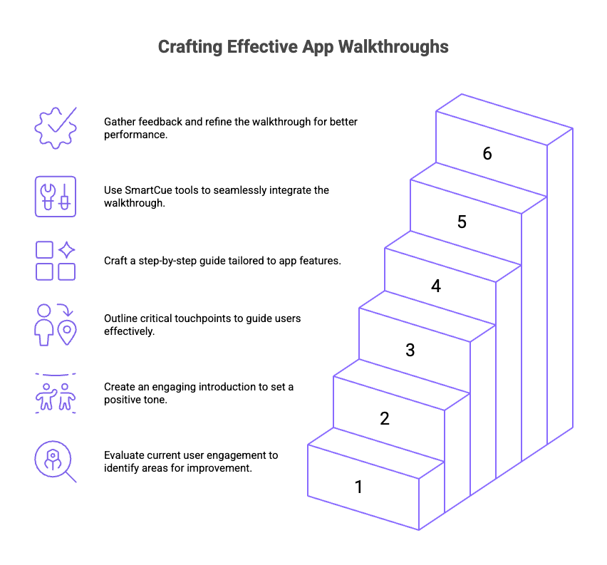
Step 1: Test Your Existing Feature Adoption Experience
Before creating a new walkthrough, it's important to assess how well existing features engage users. An in-depth exploration of the current feature adoption experience unveils areas of improvement.
Recognizing these gaps and charting out a roadmap for a new walkthrough becomes more efficient, leading to promising results in terms of increased conversions.
Step 2: Start with a Welcome Screen
First impressions matter! The first step towards creating an effective walkthrough begins with an engaging welcome screen that contains essential design elements. It acts as a warm gesture, assuring users about their decision to try your app.
A brief description of what’s in store further enhances their curiosity, stirring them to explore more. This simple yet crucial step sets a positive tone for an incredible onboarding experience.
Step 3: Map the User Journey
Understanding the critical junctures of the user journey map is fundamental while designing a walkthrough. Highlighting essential features and hotspots that a typical user needs to interact with provides a clear path in mapping the user journey.
Enumerating these touchpoints ensures that the devised walkthrough mirrors their in-app expedition, making it a highly efficient and personalized guide.
Step 4: Design Your Walkthrough
Once the user journey is mapped, it's time to bring the walkthrough to life. Craft a step-by-step guide that echoes your app’s unique features and navigates users through various elements effectively. The key focus should be on keeping this guide interactive and user-friendly, ensuring that users can fully engage with the rest of the walkthrough.
Remember, a well-devised guide tailored around your app’s features can be the driving force in launching your users towards maximum feature adoption.
Step 5: Build with the Right Tools
Leverage SmartCue’s walkthrough tools, like the feature highlighting and progress tracking tools, to seamlessly integrate your guide into the app. These tools simplify the process of creating, deploying, and managing walkthroughs, ensuring they remain engaging and effective throughout the user journey.
Step 6: Test and Optimize
Once the walkthrough is implemented, conduct user testing to gather feedback. Analyze performance metrics like engagement and conversion rates, and make necessary adjustments.
Continuous optimization ensures the walkthrough remains aligned with user needs and consistently drives higher conversions.
Show, Don’t Tell. Create Demos That Close Deals
What are Some Outstanding App Walkthrough Examples?
A great app walkthrough doesn’t just teach, it delights, engages, and converts. Learning from apps that nailed their onboarding can spark ideas for your own experience while helping you avoid common UX pitfalls.
Here are some standout examples of in-app walkthroughs that transformed first-time users into loyal customers:
1. Lightbulb.ai
Lightbulb.ai provides real-time emotion recognition technology, helping businesses analyze emotional responses and make data-driven decisions.
What makes it great:
Self-serve demos showcasing real-time emotion tracking.
Interactive product tours demonstrating AI-driven insights.
Frictionless onboarding for faster adoption of analytics tools.
Results:
Higher engagement, faster onboarding, and increased product adoption. The demo helps users grasp the platform’s value quickly, leading to stronger conversions.
2. ContractKen – AI Copilot for Contracts
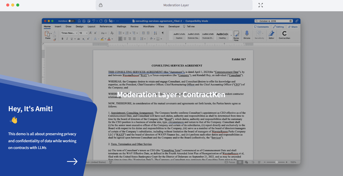
ContractKen streamlines contract drafting, review, and negotiation within Microsoft Word, combining AI-driven automation with human expertise for faster, more accurate contract management.
What makes it great:
Self-serve demos for hands-on exploration of AI-assisted contract workflows.
Product tours showcasing real-time AI insights and document analysis.
Frictionless onboarding designed for legal professionals.
Results:
Faster onboarding, improved adoption, and higher engagement. The demo accelerates contract workflows, reducing manual effort while increasing accuracy and compliance.
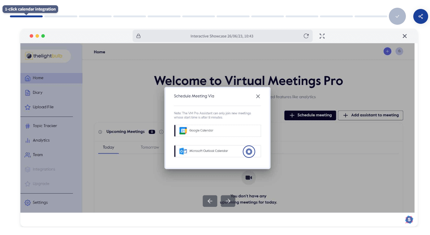
3. Zoptiks – Virtual Field Trips & Microschool Software
Zoptiks provides AI-powered virtual field trips and microschool solutions, enabling immersive, interactive learning experiences for students and educators.
What makes it great:
Self-serve demos for hands-on exploration of virtual field trips.
Product tours highlighting microschool software capabilities.
Onboarding flows are designed for both educators and students.
Results:
Higher engagement, improved educator adoption, and enhanced student learning experiences. The demo shortens the learning curve and drives faster adoption of virtual learning solutions.
Next read:Mastering Product Demo Checklist for Success – because a great walkthrough deserves an equally great demo.
How Did These Brands Create Such Seamless App Walkthroughs?
Notice something common among these top examples: none of them feel forced, clunky, or out of place. They guide users naturally, almost like the app is reading your mind.
The secret? Behind-the-scenes, these brands rely on no-code interactive walkthrough tools that let them build, customize, and refine experiences quickly, without endless engineering cycles.
That’s where platforms like SmartCue come in. It allows teams to:
Create and launch walkthroughs in minutes with drag-and-drop simplicity
Personalize the flow to match branding and user segments
Track engagement to see which steps delight users (and which need tweaking)
By using a solution like SmartCue, you can turn your onboarding into a conversion engine, without overwhelming your users or your developer's team.
Your app’s “aha moment” is waiting.
Chat with Robin to see how SmartCue can get you there faster.
Or skip the small talk and start your free trial.
Conclusion
Users rarely tell you they’re lost; they just leave. An app walkthrough isn’t about showing off features; it’s about giving people confidence in those first 30 seconds. When users feel guided, they stay, explore, and even become your biggest advocates.
So here’s the real secret: a great mobile app walkthrough examples isn’t just teaching software, it’s starting a relationship. Because every tap, swipe, and click is really your chance to say, “Welcome, we’ve got you covered.”
Frequently Asked Questions
What makes a good walkthrough?
A good guided walkthroughs in-app tutorial is clear, interactive, and tailored to the target audience. It highlights specific features, follows a logical sequence of steps, and improves ease of use while driving user engagement and product growth.
What are in-app guides?
In-app guides are interactive guides or tooltips that help new customers explore key product features. They act as a good start for onboarding and improve the overall product experience.
What does a walkthrough consist of?
A walkthrough typically includes a welcome page, step-by-step highlights of key features, optional video tutorials, and a next step prompt to encourage user retention and engagement.
What is a product walkthrough?
A product walkthrough is an interactive guide that introduces product managers, product teams, or end users to new features, ensuring they understand the value proposition and can use the app effectively.
What should a user be able to do after the walkthrough?
After a virtual walkthrough app, a user should complete the onboarding checklist, navigate the user interface, and confidently interact with specific features, boosting user engagement and retention.
How app walkthrough demo video examples are curated?
They are curated based on best practices, use cases, and user feedback, often using A/B testing to optimize flow, highlight value propositions, and demonstrate ease of use to the target audience.
What style best conveys app functionality?
A step-by-step interactive guide with video tutorials and visual highlights on the user interface works best. Combining good app walkthrough design with a welcome page ensures a smooth product experience.
How do I onboard customers onto my app?
How to create compelling mobile app walkthroughs is to use a project management tool or customer support tool to build an onboarding checklist with interactive guides, video tutorials, and next step CTAs to drive user engagement and product growth.
What's the difference between walkthrough and gameplay?
An app walkthrough software explains specific features and ease of use for apps, while gameplay focuses on entertainment or challenges. In apps, walkthroughs improve user behavior understanding and product experience.
How do you measure the success of an app walkthrough?
Success is measured with A/B testing, user feedback, and user behavior analytics. Tracking user engagement, retention, and the adoption of new features helps product teams optimize the next step in onboarding.
Comments
Your comment has been submitted